Vancouver Goldeneyes’ Jersey Leak Points to Familiarity in Building Identity
An early glimpse of the Vancouver Goldeneyes’ new jerseys suggests a deliberate reliance on established visual elements, reflecting a common approach to brand building.
SINGAPORE
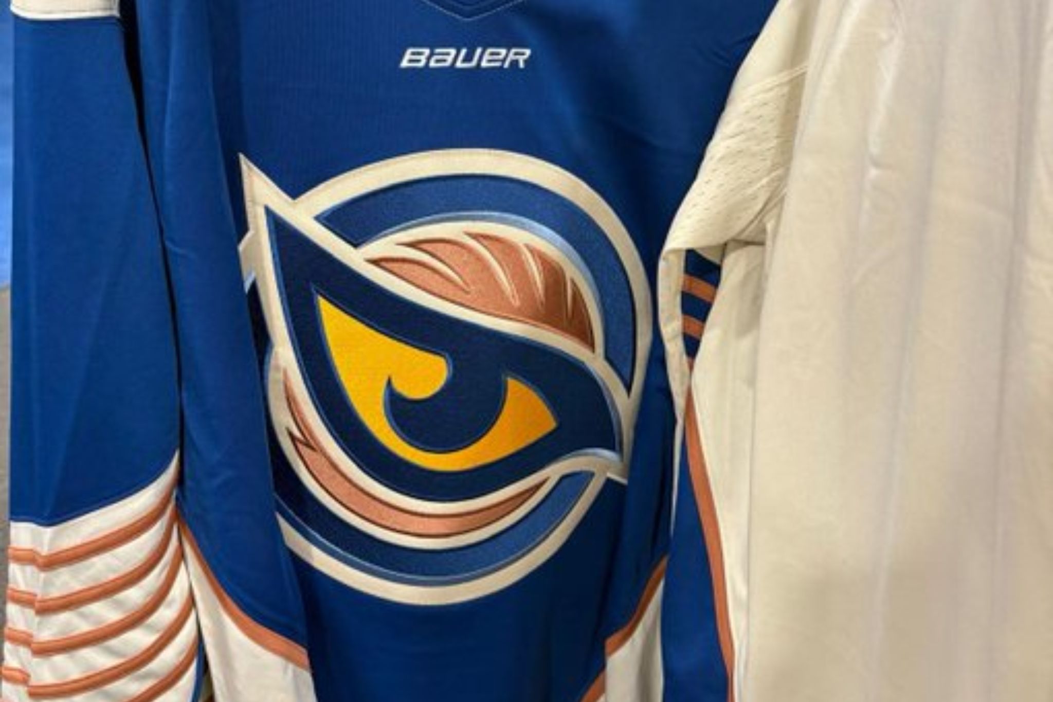
The reported leak of new jerseys for the Vancouver Goldeneyes offers a quiet insight into how new entities establish their public face. Fans captured photos of two new Goldeneyes jerseys on racks in a Vancouver sports apparel store, available for purchase. This occurred before any official reveal for their sophomore season, which is slated to get underway in early December. The team had worn one generic jersey with a diagonal “Vancouver” wordmark on the chest for their inaugural season, a strategy that provided time to develop a more polished design.
The jerseys are said to maintain the Goldeneyes’ established color scheme of blue, copper, and white. This continuity suggests a cautious evolution rather than a complete overhaul for a team still finding its place. In June 2026, the Vancouver Goldeneyes selected US Olympian Caroline Harvey with the first pick in the draft. The team had also fired coach Brian Idalski after its expansion club’s first season, a move that could suggest internal pressures to secure performance.
This premature display of new designs, whether intentional or accidental, bypasses the usual controlled rollout common in professional sports. For enthusiasts and casual observers alike, the immediate availability of new team apparel allows for an organic, unofficial reception. This contrasts with formal presentations, which are typically designed to shape public perception through carefully chosen narratives and imagery.
While jerseys might seem a minor detail in the broader landscape of professional sports, they function as a significant cultural signal. Sporting attire often acts as a banner of affiliation, reflecting a community’s values and aspirations. The decision to retain a familiar color palette, even while introducing new designs, suggests a strategic anchoring to an existing fan base and local identity. This is particularly relevant for an expansion team. Had the leak revealed an entirely different aesthetic, it might have indicated a broader re-branding effort or a desire to shed an initial, potentially less successful, image. The visual consistency suggests comfort in an established visual language.
This reliance on familiar motifs, however, is not without potential limitations. While it fosters immediate recognition and a sense of belonging for existing supporters, it may also inadvertently limit the team’s appeal to broader or new demographics. A new franchise, seeking to carve out a distinct identity in a crowded market, sometimes benefits from bolder, more surprising choices. This visual conservatism, however, aligns with a common human inclination to gravitate towards the known, particularly in the early stages of building a shared experience.
For an Asia-Pacific audience, this subtle negotiation of identity through design holds a mirroring quality. Across various cultural exports and burgeoning industries in the region, there is often a tension between maintaining traditional aesthetics that resonate locally and adopting global trends to expand appeal. The Goldeneyes’ jersey situation, while geographically distant, illustrates this balance between a rooted identity and aspirational evolution. It reflects a tendency to find comfort in the familiar, even as new ventures seek to establish themselves in competitive environments. The choice to keep a consistent color palette speaks to this enduring preference for the recognizable.
Sources
Newsletter
Pacific Daily
A curated briefing from Thailand, Asia-Pacific and the world.